Slide Presentation
http://slides.com/porfiriomoreno/pencil-me-in#/
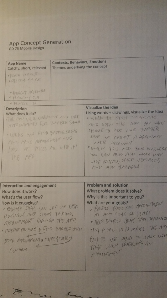
Definition statement
- The purpose of your App
The purpose of my app is to reduce the time spent taking phone calls for appointment bookings, manage schedules for barbershops and beauty salons, and for their customers to quickly make appointments through the app. I don’t want to eliminate the method of taking appointments through the phone I want to expand the accessibility users have for making appointments.
- Who it’s for and how they’ll use it.
My app is for barber shop/beauty salon owners, their employees, and their customers. Barbershops and beauty salons can set up an efficient and organized way to take customers appointments and for their customers to quickly make appointments. Barber shops/beauty salons can set up their business and add employee schedules and start taking appointments, and customers will be able to make/cancel appointments, view prices, message barbers directly if they are running late or if they have any questions.
- It’s core functionality.
The app’s core functionality is to set and organize appointments for barber shops or hair salons and for a customer to quickly set up appointments.
- Pain points
- When a barbershop is full barbers usually have to decide who will answer the phone. The app will reduce the number of appointments made through the phone.
- If the user forgets when they set their appointment the can look at the app and it will let them know when their appointment is set and can even notify them on the day of.
- When running late you can directly message barbers and let them know otherwise barbers will think they won’t show and instead attend someone else.

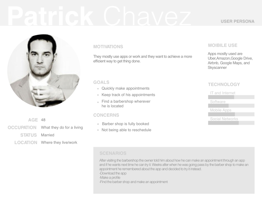
Personas
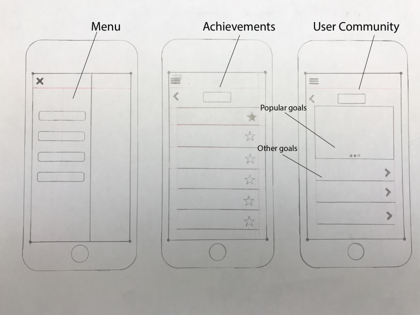
Sketches
Wireframes
Design pattern study
User Profile
Search
List
Calendar
logins
Notifications
User Testing
Product Under Test: Pencil Me In App
Goal: The goal for the Usability test is to improve the design and usability for users.
Participants
2 people who frequently go to the barbershop
1 barber shop owner
Test Task
BarberShop customers
1.Create A Profile
2.Find a barbershop/salon
3.Book an appointment
4.Message the barber
Barbershop Owner
1.create a profile
2.add prices and services
3.Edit profile
Equipment
Mobile Phone
Data will be recorded with screenshot of task
Test Participant #1(Barbershop customer)
Task
1.Create A Profile
2.Find a barbershop/salon
3.Book an appointment
4.Message the barber
Questions
1.Did you find completing any of task difficult?
Task #2-Yes it would be helpful if there was a pop-up or something guiding you to what you can do next.
2.Was there anything you didn’t understand or didn’t like?
Task #1-Yes I would like to reconfirm my password or be able to see it after I type it.
3.Was there anything you did like or found interesting?
Task #1-That it did not ask for unnecessary requirements to sign up.
Task # 2-that the navigation was easy to find.
Task #3-Being able to choose a barber/stylist.
Task #4-That the app tells you who you are messaging.
4.What could be improved?
Task #1-how will that app know your location after you sign up.
Task #2-A pop up or something telling you what you can do in the app.
Task #4-More info on the barbers and pictures on the work they do.
Test Participant #2 (Barbershop customer)
Task
1.Create A Profile
2.Find a barbershop/salon
3.Book an appointment
4.Message the barber
Questions
1.Did you find completing this task difficult?
No
2.Was there anything you didn’t understand or didn’t like?
Task #2- did not understand if all the barbers were available.
Task #2 is there an order I have to follow or can I start with barber first.
3.Was there anything you did like or found interesting?
Task #2 I like that the pictures of the barbers appear because I might not remember their names
Task# 4- that you can message the barber
4.What could be improved?
Task #2-Can you choose a barber first. Adding reviews
Test Participant #3 (Barbershop Owner)
Task
1.Create a profile
2.Add prices and services
3.Edit profile
Questions
1.Did you find completing this task difficult?
No
2.What can be improved?
A way to display upcoming appointments like on a tv.
Add more options
Can I look at previous appointments made
3.Was there anything you didn’t Understand?
How do the barbers get the messages directly?
What if I have multiple barbershops?
How do barbers login, does everybody use the same account?
OverAll Findings
I noticed when the second test participant was asked to find a barber shop they first clicked on the menu at the top left and not the quick menu at the bottom. When I asked them why they didn’t click the menu at the bottom they said they did not notice it and when I asked them to repeat the task they clicked the search icon instead of the shop icon. To improve the usability I might add the name at the bottom of the icon. To improve the book an appointment design I decided to add a filter function so the user can start wherever, the user can start with a barber and then the app will display when and what time the barber has available. For the barbershop owner, I decided to add a display function that they can use during work that will display the barbers and their schedules.


")
")
")
")


")
")
")
")

")
")
")
")
")
")

")


